

Designing a New Feature for HoYoLAB
Turning a Maze into a Map: A More Intuitive HoYoLAB Experience

MY ROLE:
End to end UX Designer
RESPONSIBILITIES:
User research, sketching, wireframing, prototyping, and user testing.
TOOLS USED:
Figma, Google Suite, Zoom, Sketchbook,
Introduction
Playing a Mihoyo game is more than just a pastime—it’s a global phenomenon. With titles like Genshin Impact, Honkai Star Rail, and Zenless Zone Zero, the studio has built an expansive player base that spans millions.
To extend the experience beyond gameplay, Mihoyo launched HoYoLAB in 2021, a companion app designed to centralize news, tools, and community interactions across its growing portfolio.
Yet despite Mihoyo’s success in game development, HoYoLAB faces significant challenges in delivering a seamless player experience. Many users either remain unaware of the app or engage with it only sparingly, citing congested navigation, difficulty finding information, and limited moderation as barriers. Reviews reflect this disconnect: a 4.0 rating on iOS and 3.5 on Android stand in stark contrast to the acclaim of Mihoyo’s games.
As Mihoyo continues to expand its universe with new titles, the app must evolve to support multiple complex game ecosystems while keeping the player experience at its core. Without clearer pathways and a more intuitive design, HoYoLAB risks losing its potential to become the central hub where players connect, explore, and deepen their relationship with Mihoyo’s worlds.
Research
Addressing HoYoLAB’s challenges meant starting with the people who use it most: the players. I wanted to dig into what keeps players engaged, where their expectations fall short, and how easily they can navigate to the features they care about most. Equally important was uncovering the pain points: the moments of clutter, confusion, or friction that left players feeling dissatisfied. These insights would inform the design of a new feature aimed at improving navigation and making key content and tools more accessible, helping HoYoLAB better serve its community.
Research Goal
We want to learn what challenges players are experiencing to understand what might be causing player dissatisfaction with the app.
Research Objectives
Understand what keeps players engaged with the app.
Explore if there are differences between player expectations of the app versus their experience
Investigate whether players can easily locate key features and access information they need.
Identify elements that may contribute to player frustration or dissatisfaction while using the app
User Interviews: Voices from the Community
Players primarily use the app to enhance their Mihoyo game experience, valuing features like official game guides and the daily check-in tool.
While the app’s design reinforces the game’s branding, social and community features are largely underused, with players preferring platforms like Discord, Reddit, or in-game interactions. Overall, the app successfully supports gameplay but could benefit from clearer navigation and broader accessibility for a wider audience.
Players Download for Game Support
Players primarily downloaded the app to enhance their experience with Mihoyo games through official tools, guides, and in-game features.
Favorite Features
The most loved app elements are official game guides/tools, the daily check-in feature, and the game-inspired visual branding.
Navigation Challenges
Players experienced initial difficulty navigating the app, with issues like unclear clickable elements, missing back buttons, and confusing submenus.
Opportunities for Improvement
Players suggested enhancements that align more closely with the gaming experience, such as easier navigation, better contrast, and features tailored to gameplay.
Limited Community Use
Most players prefer interacting with other gamers on platforms like Discord, Reddit, and Twitter rather than through the app’s community features.
Competitive Analysis: Understanding the Market
Reddit, Discord, and Steam thrive on player-driven communities, but official news, updates, and in-game tools are often scattered and inconsistent.
Much of the content on these platforms is unofficial and user-generated, leaving players to piece together reliable information. HoyoLab addresses this gap by centralizing developer updates, in-game rewards, and trusted resources, creating a single, seamless hub that offers a more consistent and trustworthy gaming experience.
Community-Centric Engagement
All three platforms (Reddit, Discord, Steam) provide spaces for player interaction through forums or servers, creating organized channels for discussion and easier access to relevant information.
Official Communication Gaps
Only Steam and Discord offer direct channels for official game updates; Reddit relies entirely on user-shared information, highlighting a lack of developer-driven communication.
User-Driven Ecosystems
Reddit and Discord communities are highly active and self-sufficient, sharing news, guides, and reward information unofficially, demonstrating the demand for centralized, reliable game content.
Supplemental Features Are Limited
While Steam and Discord provide news, features like in-game rewards and developer-curated guides are largely absent or user-created, leaving gaps in the holistic player experience.
Opportunity for HoyoLab
The reliance on unofficial channels shows a need for a platform that combines community interaction with direct developer updates, official news, and in-game tools—positioning HoyoLab as a more integrated player hub.
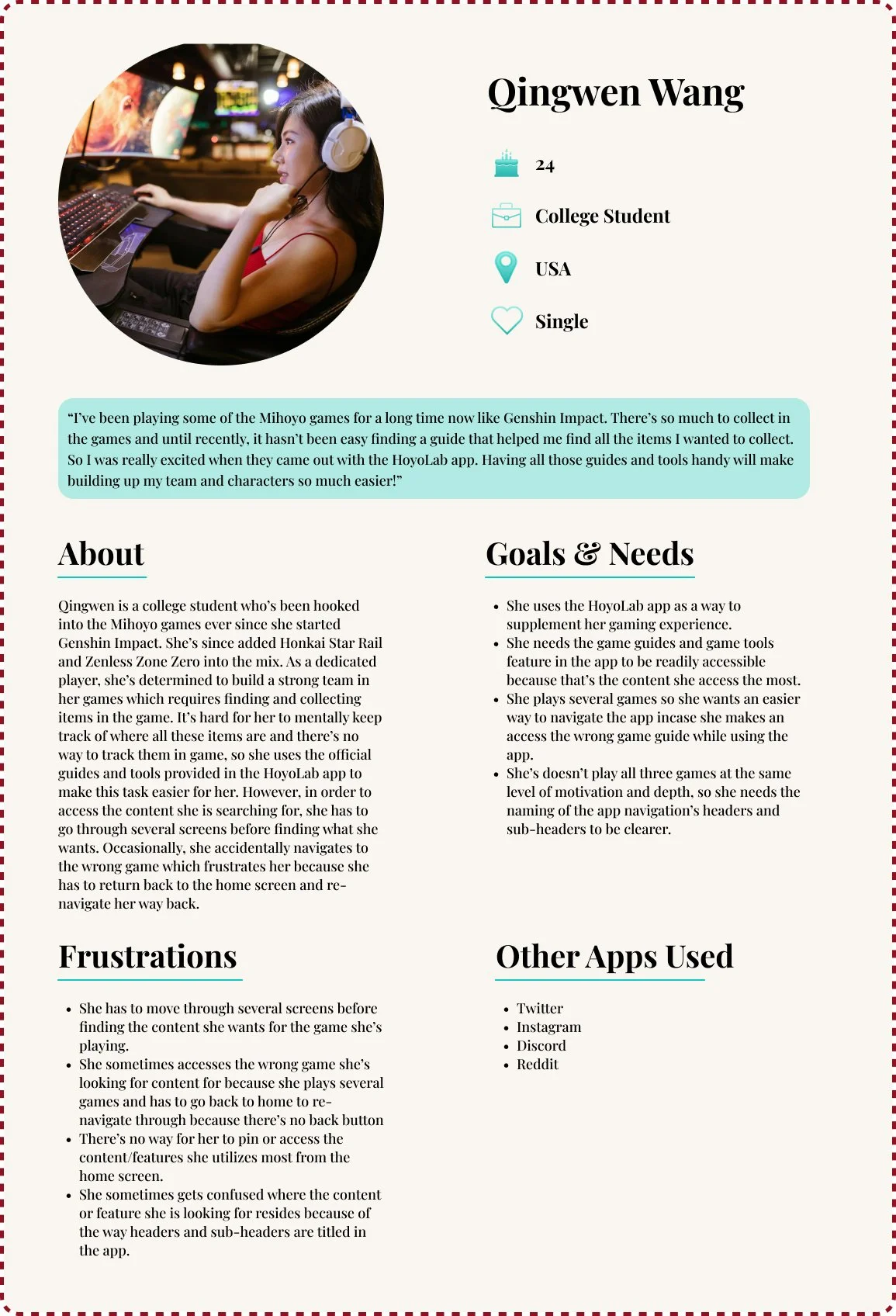
User Persona: Who is the Player Base
These insights shaped a user persona centered on a Mihoyo player who values game-related tools and features that enhance their gameplay.
The player appreciate the app’s game-centric design yet encounter challenges navigating certain features, highlighting a need for clearer paths and more intuitive interactions. This persona guided design decisions to balance immersive game experiences with usability and accessibility.
Design: Bringing the Feature to Life
Insights from the user persona directly informed the problem statement by highlighting that players value game-focused features but struggle to locate them, creating frustration and a steep learning curve.
These findings shaped the Problem Statement and “How Might We” question, framing the challenge as an opportunity to improve accessibility.
Problem Statement
Players frequently access specific features of the app, such as game guides and tools, to supplement their gaming experience but finding these features is often a confusing process. This creates a learning curve that can lead to frustration and reduce engagement in the app.
“How Might We” Question
How might we develop an easier way for players to access the features they want, reducing a learning curve and providing them a more enjoyable experience?
To address this, the design focused on creating clearer navigation and intuitive pathways, making it easier for players to reach the tools and guides that enhance their gaming experience.
Mapping the Game Hub: From Mental Models to Intuitive Navigation
To address the navigation challenges players faced in the HoYoLAB app, I developed a redesigned user flow specifically for accessing the Battle Records feature. The flow streamlines the journey from the home page to reviewing battle records. This visualization identifies friction points while providing a clear roadmap for a smoother, more intuitive, and engaging in-app experience.
Based on player feedback highlighting confusion with app navigation, I first mapped the original sitemap to understand the intent behind its hierarchy. This revealed redundancies—such as features duplicated under multiple games—and helped identify opportunities to simplify the structure.
Before proposing a new sitemap, I conducted a card sort to see how players naturally grouped features. This approach ensured that the redesigned structure aligned with players’ mental models, making key tools and guides easier to find and use.
Wireframing & Prototyping
Low Fidelity Wireframes
Although the app provided a basic structure and layout, I began with low-fidelity wireframes to explore ways to create a more intuitive navigation path for players. Working in low fidelity allowed me to focus on the flow and organization of the app, ensuring that navigation nuances were prioritized over visual design details.
High Fidelity Wireframes & Prototype
Building on the low-fidelity wireframes and the insights gathered, I advanced the design into the high-fidelity stage.
User Testing: Putting the App to the Test
Users responded positively to the platform’s clean, minimalistic design, intuitive layout, and accessible typography, finding it easy to navigate and familiar compared to other mentoring tools.
Usability testing revealed that while general navigation was smooth, users struggled with task efficiency—especially when scheduling meetings or managing goals. They consistently requested quicker ways to access frequent actions, such as scheduling meetings, updating availability, or adding goals, and suggested features like a floating “plus” button, customizable quick-access buttons, and clearer navigation back to the dashboard. This feedback highlights that even a simple, well-designed interface benefits greatly from thoughtful shortcuts and task-focused enhancements.
Participants
5 users (2 mentors, 1 mentee, 1 alumni)
Tasks Tested
Find the Battle Records feature for Honkai: Star Rail
Completion
✅ 100% success rate
General Feedback
Navigation is easy
Screen flow is a little confusing
Visuals feel bland
Consistent across users
Task 1 – Find the Battle Records feature for Honkai: Star Rail
All players found navigation to be intuitive, simple, and accessible.
3/5 players expected the Guides & Tools screen to be where the Game Select is.
3/5 players felt the screens lacked the playfulness of the original app.
Usability praised across new and experienced players.
Iterations
Following usability testing, the focus shifted to refining the app experience based on player feedback. This phase prioritized understanding what worked well and identifying opportunities for improvement, particularly around navigation clarity and visual engagement. Insights from a mix of new and experienced users helped guide targeted revisions, ensuring the app is both intuitive and enjoyable to use while highlighting areas that would benefit from closer alignment with HoyoLab’s branding and playful aesthetic.
Looking Ahead at Next Steps
Moving forward, a key next step would be to collaborate more closely with the HoyoLab team to implement revisions that align with the brand’s established identity. While I was able to identify opportunities for improving navigation and user experience, full implementation would require access to the company’s branding guidelines, aesthetics, and custom UI elements. Partnering with the internal design and development teams would allow these updates to be executed effectively while maintaining consistency with the existing product.
Additionally, future iterations could involve deeper testing across different user segments, particularly comparing veteran and newer players, to ensure updates meet the needs of all users. This experience also highlighted the value of understanding existing infrastructure and intentionally targeting improvements, which I plan to carry into future projects. Working with a client still defining its identity will provide a contrasting challenge, allowing me to apply the lessons learned from refining a mature product while navigating a more flexible design environment.