

Yale School of Art Case Study

Redesigning a Digital Canvas for Clarity and Creativity
MY ROLE:
End to end UX Designer
RESPONSIBILITIES:
User research, sketching, wireframing, prototyping, and user testing.
TOOLS USED:
Figma, Google Suite, Zoom, Sketchbook,
Introduction
The Yale School of Art has a reputation for shaping some of the most influential artists of our time, from Kehinde Wiley to generations of groundbreaking creatives. But while the school itself stands at the forefront of innovation, its website tells a different story.
Yet despite its reputation, the school’s digital presence tells a more complicated story. The Yale School of Art website, intended as an “ongoing collaborative experiment,” embodies the spirit of creativity but often at the cost of usability. Its wiki-like structure, inconsistent visual design, and unconventional layouts create barriers for users navigating the site. Prospective students searching for admissions details, current students seeking resources, and faculty trying to share updates all face the same challenge: information is difficult to locate, buried in a maze of confusing navigation. This friction undermines the site’s effectiveness as both a communication tool and a reflection of the school’s prestige.
In this project, I explore how the website can be redesigned to balance creativity with clarity, bringing usability and responsiveness to a digital space that reflects the school’s artistic spirit without sacrificing functionality.
Research
To move this redesign beyond assumptions and ensure it truly addressed user needs, I began with research. While the Yale School of Art website carries an intentional sense of experimentation, it was critical to understand how real users actually experienced the site. By grounding the project in user insights, the goal was to uncover opportunities for improving navigation, accessibility, and responsiveness without stripping away the site’s creative identity. This research phase set the foundation for all design decisions that followed.
Research Goal
We want to understand how users interact with the Yale School of Art website in order to identify usability challenges and opportunities for improving navigation, accessibility, and responsiveness—while preserving the site’s artistic character.
Research Objectives
Assess user navigation patterns to identify areas of confusion or inefficiency in the current site structure.
Evaluate the accessibility and discoverability of key information (e.g., admissions, academic programs, exhibitions) across different user groups.
Examine cross-device performance (desktop vs. mobile) to uncover usability issues related to responsiveness and readability.
Gather user perceptions of the site’s visual and experimental design to understand its impact on usability and engagement.
Identify the goals and needs of the primary user groups (prospective students, current students, faculty, alumni, and community members) when using the website.
Explore ways to balance artistic expression and functional design to ensure the website remains true to its creative vision while improving usability.
User Interviews: What Matters to Most to Site Visitors
Through my conversations with people using the Yale School of Art website, a clear tension emerged: while the site’s design celebrates creative freedom, its layout often leaves users frustrated when trying to locate essential information.
I conducted user interviews to capture firsthand perspectives from site visitors. These conversations revealed not only the navigation challenges users faced but also the emotional impact of those struggles. The insights gained from these interviews provided crucial context, helping to frame the design problem through the lens of the users’ experiences.
Visual Design & Branding
Outdated look doesn’t reflect an innovative art school.
Cluttered layout, poor spacing, and weak color use overwhelm users.
Lack of compelling imagery (campus life, student work) misses storytelling opportunities.
Navigation & Usability
Unclear organization and headings make information hard to find.
Small text, low contrast, and weak hierarchy hinder readability.
User Experience & Perception
Frustration with disorganized structure.
Users question the school’s credibility and forward-thinking identity.
Information Clarity & Content
Important details get buried because nothing stands out visually.
Users are forced to read everything just to find basic info.
Lack of clear headings and contrasts reduces scannability.
Competitive Analysis: Learning from Art Schools & Museums
Comparisons revealed that while each site successfully embodies its institution’s values, they also expose the challenges of balancing aesthetics with usability. For Yale, the opportunity lies in finding a middle ground.
The competitive analysis of RISD, CalArts, and SFMOMA highlighted how each institution’s website reflects its unique brand identity while balancing varying levels of usability and engagement. Collectively, these comparisons revealed that while each site successfully embodies its institution’s values, they also expose the challenges of balancing aesthetics with usability.
Visual Identity & Branding
Each institution reflects its unique identity:
RISD → professional, academic.
CalArts → bold, avant-garde.
SFMOMA → modern, impactful.
Strong branding can reinforce institutional values, but extremes (too conventional or too overwhelming) risk disconnecting from users.
Aesthetic Engagement vs. Usability
RISD → clear hierarchy, but conventional and not visually engaging.
CalArts → creative visuals, but dense text and colors reduce accessibility.
SFMOMA → strong color branding, but overuse becomes overwhelming.
Takeaway: Striking the right balance between aesthetics and clarity is critical.
Information Accessibility
RISD: Easy to read but lacking inspiration.
CalArts: Overly dense text hampers digestibility.
SFMOMA: Visual dominance can overshadow content.
Takeaway: Users need both engaging design and accessible information delivery.
Heuristic Evaluation
I conducted a heuristic evaluation of the Yale School of Art website to uncover usability issues. The evaluation highlighted challenges like cluttered layouts, inconsistent hierarchy, and limited responsiveness—issues that closely mirrored the pain points identified during user interviews.
The unconventional layout with all the information pushed to the left side does not align with the typical user experience of having information centered.
There is no clear way to return home or go back so users may feel stuck, especially as they are trying to seek information.
The content heavy and dynamic pages full of varying colors, font sizes, and the occasional animated background makes the site visually inconsistent.
There is a lack of CTA buttons and the overwhelming visual nature of the site make it challenging for users to access and find information easily.
Confusing information hierarchy (i.e. the apply to school page provides information to admissions and tuition) can further impair a user’s ability to find information.

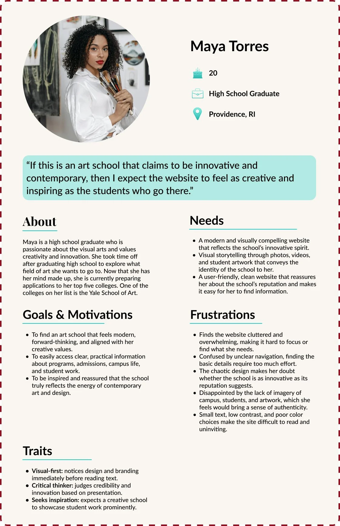
User Personas: Meet the People Behind the Platform
By combining insights from each research method, these findings were distilled into user personas that captured their goals, challenges, and motivations.
I created a persona of a mentor and a mentee as they are the people I would be primarily designing for. The personas served as an anchor for the design process, ensuring that every feature and interaction was shaped around the real needs and lived experiences of the CLCDN community.
Design: Bringing the Vision to Life
Grounded in the insights from our user personas, it became clear that prospective students face significant challenges navigating the Yale School of Art website.
Finding information most relevant to prospective students or even school visitors, such as program details and exhibition information, are often obstructed by the site’s cluttered layout, unclear hierarchy, and inconsistent readability. This friction leads to frustration, cognitive overload, and a diminished user experience. To address these challenges, the redesign was guided by the following:
Problem Statement
Prospective students visiting the Yale School of Art website find it difficult to locate key information because the website’s cluttered layout, unclear hierarchy, and lack of readability force them to dig through content.
“How Might We” Question
How might we reduce frustration so students and prospective students exploring the website feel less frustrated and overwhelmed?
To address these challenges, I redesigned the Yale School of Art website with clarity, simplicity, and usability at the forefront. Drawing inspiration from the parent Yale University site, I created a layout that is clean, consistent, and easy to navigate, while still allowing the Art School’s experimental spirit to shine through.
Rearranging the Canvas with the Help of Site Visitors
Building on the problem statement, I designed a user flow to map how mentors and mentees could more easily schedule, connect, and stay engaged within the platform. The flow illustrates a streamlined journey—from receiving reminders, to selecting meeting times, to confirming and documenting their sessions—all with mobile-friendly touchpoints that fit into their daily routines. By visualizing these steps, the user flow provides a blueprint for reducing friction, supporting consistency, and making mentorship interactions more intuitive and sustainable.
To better understand how users mentally categorized content, I conducted a card sort. This exercise revealed information was grouped and categorized, providing a clear view expectations and mental models. Using these insights, I developed a simplified sitemap for the redesign, streamlining navigation and making key content—like admissions, programs, and exhibitions—easily discoverable. The result was a sitemap that balances usability with the school’s creative identity, forming the backbone of a more accessible and navigable website.
Wireframing & Prototyping: From Sketch to Showcase
Low Fidelity Wireframes
To translate the improved structure into tangible designs, I began with low-fidelity wireframes. These sketches allowed me to focus on layout, hierarchy, and navigation flows without being distracted by visuals. This iterative process made it possible to test functionality early while gradually layering in the visual identity of the Yale School of Art.


Style Tile
The Yale School of Art is part of the broader Yale University ecosystem, which is instantly recognizable by its signature color, Yale Blue. This association was reinforced during user interviews, where participants emphasized the importance of aligning with the university’s established visual identity. Noting the lack of a cohesive palette on the School of Art’s site, I created a new color system that integrates Yale Blue while introducing a vivid red to serve as a bold, creative accent.

High Fidelity Wireframes & Prototype
Combining all of the above together with the low fidelity wireframes, I brought the design into the high fidelity stage. To demonstrate responsiveness, I also developed a mobile version for the home screen.
User Testing: From Concept to Real Time Feedback
Usability testing revealed that users found the updated interface intuitive and visually appealing, with no major issues identified in the UI itself. The main takeaway, however, was the need for consistent navigation
While usability testing confirmed that the interface was largely intuitive and visually effective, the insights gathered informed minor but meaningful refinements. The focus was on enhancing navigation consistency—ensuring the Yale icon and subheader links behaved predictably across all pages. These subtle iterations reinforced a seamless user experience without requiring major redesigns.
Participants
5 users
Tasks Tested
Submit an application to the Yale School of Art
Completion
✅ 100% success rate
General Feedback
Easy to navigate & intuitive layout
Color palette aligns with Yale branding (Yale Blue + pop of red)
More student & campus photos appreciated
Application process feels familiar; no major pain points
Task 1 – Submit an application to the Yale School of Art
Users expect the Yale icon to always return to home (4/5)
Academic & Admissions links should consistently navigate back (3/5)
Some users want collapsible sections (1/5)
Looking Ahead at Next Steps
This project pushed me out of my mobile design comfort zone and into the complexities of a larger screen. Redesigning the Yale School of Art website meant rethinking layouts, spacing, and visual hierarchy while keeping usability at the forefront. Seeing the site transform from cluttered and confusing to purposeful and intuitive was incredibly rewarding. User research and testing highlighted the power of branding—Yale’s identity is strongly tied to its color palette, making thoughtful visual choices essential for trust, recognition, and a seamless user experience.
Future iterations will focus on preserving the clarity and straightforward design as new pages are built out, ensuring the site remains intuitive and easy to navigate. Maintaining the simplicity of the Yale color palette will also be a priority, as it is the most iconic element of the school’s branding. This project reinforced the importance of adaptability and balancing creativity with functionality—principles that will continue to guide my approach to crafting experiences that are both visually compelling and meaningful for users..