

CLCDN Mentorship Platform Case Study
Simplifying Mentorship for Nurses, Strengthening Connections for Growth

MY ROLE:
End to end UX Designer
RESPONSIBILITIES:
User research, sketching, wireframing, prototyping, branding & style, and user testing.
TOOLS USED:
Figma, Google Suite, Zoom, Sketchbook,
Introduction
Transitioning from student to professional is never easy—especially for nursing students. Many first-year nurses leave the profession, often because they lack a strong support system during this critical period.
The Clinical Leadership Collaborative for Diversity in Nursing (CLCDN) was created to bridge this gap by pairing students with experienced nurse leaders. Mentorship begins in the students’ final two years of study and continues through their first year on the job. These relationships form the foundation of the program’s success, helping fellows grow into confident, resilient nurse leaders.
Following a $20 million expansion, the program faces significant challenges in sustaining its rapid growth due to the lack of an effective, dedicated mentoring platform. The program currently depends on fragmented tools like email and spreadsheets, which hinder engagement tracking, goal monitoring, and data collection for funder reporting. Although the team has adopted MentorLead, the platform has received mixed feedback: it is not mobile-responsive, lacks an app, and limits data export—barriers that are especially problematic given that mentors are busy nurses with demanding schedules and fellows are students who rely heavily on mobile access.
Without a centralized, accessible, and data-friendly platform, the program risks inefficiency and diminished impact, underscoring the need for a tailored solution that supports meaningful connections while meeting operational demands.
Research
To tackle this challenge, I started by focusing on the people at the heart of the program—nurse mentors balancing demanding shifts and student fellows juggling school, work, and family. I wanted to understand what truly helps them stay connected, what makes their mentoring relationships meaningful, and how a platform could fit seamlessly into their daily lives.
Research Goal
We want to understand what features best support the mentoring relationship and keep mentors/mentees engaged that also aligns with the data export needs of the CLCDN Team.
Research Objectives
Understand what makes the mentoring relationship successful for the mentor and mentee.
Identify what are the current key features that effectively support and enhance the mentoring relationship for both mentors and mentees in the CLCDN program.
Understand the engagement behaviors of mentors and mentees to develop a platform that can fit into their busy lives.
Explore what drives consistent engagement and communication between mentors and mentees.
Determine the data export requirements of the CLCDN Team and how they can fit into a platform.
User Interviews: Honest Conversations with the People in the Program
Mentors and mentees expressed a need for a simpler, more connected platform—one that provides structured guidance to build confidence, track growth, and foster a sense of belonging.
To better understand their challenges as busy nursing professionals with demanding priorities, I conducted user interviews with both mentors and mentees. I also spoke with program team members, since the platform’s data would be critical for funder reporting. What became clear is that while a platform could be highly valuable, a poor user experience would only hinder relationship-building and reduce its effectiveness.
Platform & User Experience
Current platform (MentorLead) feels clunky and unappealing.
Used mostly for note-taking + time tracking.
Pain points: shallow progress notes, difficult scheduling/integration.
Wish list: cleaner layout, calendar sync, all resources (messages, notes, goals) in one hub.
Mentorship Engagement
Mentees want structured guidance (ice-breakers, conversation starters).
Goal-setting feels pressured → need flexibility + ways to revisit past goals.
Clearer paths for tracking growth over time.
Nursing Mentorship Insights
Mentorship is essential for career growth + support, especially for new nurses & nurses of color.
Provides confidence, belonging, and navigation of diverse career paths.
Consistency matters, but time demands make it challenging.
Check-ins & Communication
Preference for monthly or group check-ins → less pressure, more sustainable
Casual texts/emails > formal video calls
Barriers: mentees fear being a burden, uncertainty on what to ask, tech mismatches.
Mentors taking initiative strengthens trust + relationship-building.
Competitive Analysis: Understanding the Market
Across the mentoring platform landscape, the tradeoff was clear: MentorLead offered the basics on a budget, MentorCloud bridged adjacent industries, and MentorPRO delivered the most polished (and priciest) experience.
Because the program’s current platform (MentorLead) was falling short, I conducted a competitive analysis to better understand the market—what each platform offered, where they fell short, and which gaps still remained.
No single platform fully satisfies user needs
MentorLead is affordable and tailored for healthcare but clunky, dated, and not user-friendly.
MentorPRO is research-backed with strong features but too expensive and not healthcare-focused.
MentorCloud is versatile and scalable but lacks healthcare specialization and clear usability support.
Usability and accessibility are key pain points
Steep learning curves, confusing workflows, and clunky UIs were common issues (especially in MentorLead).
Lack of mobile responsiveness or poorly designed mobile apps weakens adoption.
Integration is expected but missing or costly
Limited or expensive integrations with Zoom, Teams, Salesforce, etc.
Organizations want seamless workflows that reduce admin burden.
Healthcare-focused mentorship is underserved
Only MentorLead is designed for healthcare, but it lacks modern UX and flexibility.
Others cater to broader industries but miss healthcare’s specific mentorship needs (e.g., tracking clinical goals, CEU integration, reflection support).
Accountability + Flexibility = Success
Current platforms struggle to support consistent connection between mentors and mentees due to busy schedules.
Scheduling, meeting documentation, and progress tracking exist but often feel clunky or fragmented.
User Personas: Meet the People Behind the Platform
By combining insights from each research method, these findings were distilled into user personas that captured their goals, challenges, and motivations.
I created a persona of a mentor and a mentee as they are the people I would be primarily designing for. The personas served as an anchor for the design process, ensuring that every feature and interaction was shaped around the real needs and lived experiences of the CLCDN community.
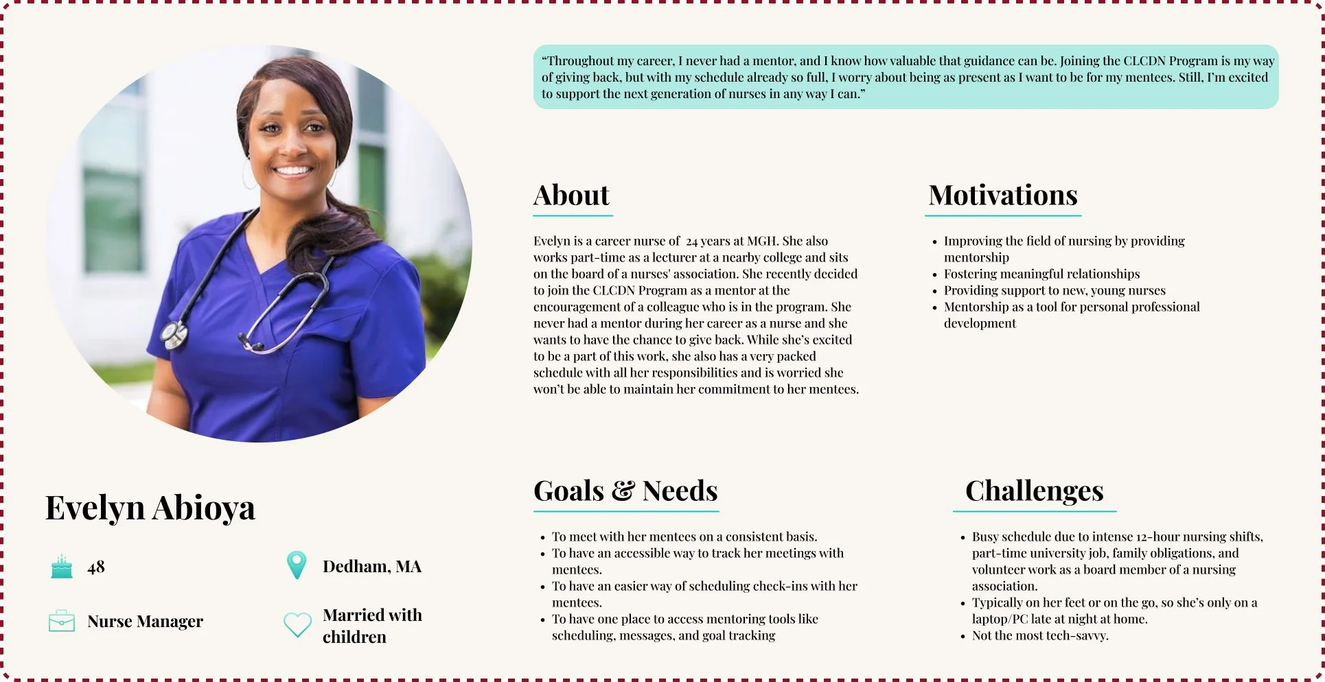
Mentor User Persona
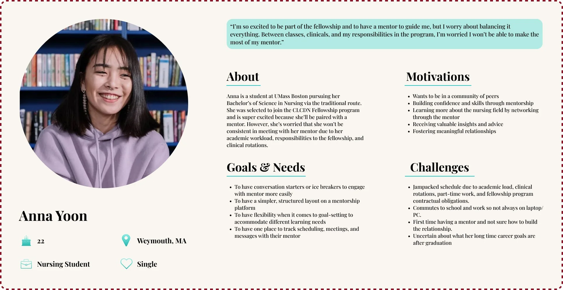
Mentee User Persona
Designing for Connection
Grounded in these user personas, the next step was to translate research insights into a clear problem statement. One of the most pressing issues that emerged was the challenge mentors and mentees face in consistently connecting, given their demanding schedules and competing priorities.
This gap underscored the need for a solution that supports accountability while providing flexibility. To frame this challenge, I defined the following problem statement and corresponding “How Might We” questions:
Problem Statement
Mentees have voiced a desire to connect with their mentors, but find themselves struggling to build the relationship when they are first paired to a mentor because they have never had a mentor before.
“How Might We” Question
How might we help mentees feel more confident and prepared to connect with their mentors?
To address this, we designed a platform that enables first-time mentees to confidently engage with their mentors by providing an easy way to schedule meetings and set goals. Mentors are also supported with tools to guide these conversations and track progress, fostering stronger relationships from the very start.
Mapping the Mentorship Journey: Shaping the Platform’s Navigation with Mentors & Mentees
Building on the problem statement, I designed a user flow to map how mentors and mentees could more easily schedule, connect, and stay engaged within the platform. The flow illustrates a streamlined journey—from receiving reminders, to selecting meeting times, to confirming and documenting their sessions—all with mobile-friendly touchpoints that fit into their daily routines. By visualizing these steps, the user flow provides a blueprint for reducing friction, supporting consistency, and making mentorship interactions more intuitive and sustainable.
By conducting card sorts with mentors and mentees, I was able to see firsthand how they naturally grouped features and anticipated navigating the platform. Observing their thought processes revealed clear patterns and expectations, which directly informed the sitemap design. This ensured that the platform’s structure felt intuitive, making essential tools easy to find and use.
Wireframing & Prototyping
Low Fidelity Wireframes
I began the design process with low-fidelity wireframes to quickly explore ideas without getting distracted by visual details. Since mentors and mentees lead highly busy lives, my main focus during these sketches was a simple layout with a clear content hierarchy.


Style Tile & Logo
UMass Boston and Mass General Brigham, the two organizations collaborating on this mentorship initiative, both use blue as their primary brand color. To visually reflect this partnership, I incorporated their signature blues into the platform’s color palette, reinforcing the connection between the two organizations.

While the program has a preexisting logo image, the image is too complex to utilize as a logo. Thus, I made the decision to redesign a simplified form for the platform. I chose to design the logo as the program acronym as the name brand of the program, the CLCDN, is well recognized between both organizations.
Current Logo

Key values of the CLCDN Program are:
Diversity
Health Equity
Leadership Development
Innovation
As these are pre-existing pillars of the program, I developed a mood board grounded in those values. Particularly diversity as I wanted it to reflect in the images I selected since it is THE core value of the program and part of the program’s mission of creating a more diverse and equitable nursing workforce.
I also added images of minimalistic simple UI to reflect the feedback from mentors and mentees from the user interviews who expressed wanting a simpler, easier, and more accessible experience navigating through a mentoring platform so they can focus more on the mentoring relationship than learning a new platform.
Moodboard
High Fidelity Wireframes & Prototype
Combining all of the above together with the low fidelity wireframes, I brought the design into the high fidelity stage.
Redesigned Logo
User Testing: Learning from the Mentors and Mentees
Users responded positively to the platform’s clean, minimalistic design, intuitive layout, and accessible typography, finding it easy to navigate and familiar compared to other mentoring tools.
Usability testing revealed that while general navigation was smooth, users struggled with task efficiency—especially when scheduling meetings or managing goals. They consistently requested quicker ways to access frequent actions, such as scheduling meetings, updating availability, or adding goals, and suggested features like a floating “plus” button, customizable quick-access buttons, and clearer navigation back to the dashboard. This feedback highlights that even a simple, well-designed interface benefits greatly from thoughtful shortcuts and task-focused enhancements.
Participants
4 users (2 mentors, 1 mentee, 1 alumni)
Tasks Tested
Schedule a Meeting
Create a Goal
Completion
✅ 100% success rate
General Feedback
Easy to navigate
Clean, minimal UI
Simple color palette appreciated
Icons & typography clear and accessible
Task 1 – Scheduling a Meeting
All users made errors
Confused by navigation & unclear labels
Wanted quicker dashboard access
Suggested clearer buttons + return-to-home option
Avg difficulty: 3/5
Task 2 – Creating a Goal
Very easy to complete
Minimal errors
Suggested faster access via dashboard shortcut
Wanted automatic return-to-home
Iterations
Based on user feedback, the wireframes were updated to improve clarity and efficiency. For scheduling, users requested a prominent dashboard button or icon for quick access, clearer labeling of actions like “Book Meeting” versus “Update Availability,” and a simplified calendar layout with stacked mentees to reduce scrolling. Visual adjustments included removing colored backgrounds on subheaders that could be mistaken for buttons. For goal management, users suggested adding quick-access buttons on the dashboard to create goals and ensuring the flow returns them to the home screen.
Looking Ahead at Next Steps
This project involved balancing the needs of multiple stakeholders. I prioritized mentors and mentees, as they are the primary users driving engagement and supporting the program’s mission. Due to organizational transitions, I often made independent design decisions, such as the logo and style tile, with plans to incorporate the program team’s input once the team stabilizes. Their perspectives will be especially important for features like data export, which support reporting to funders and the program’s long-term success.
Additional future iterations of the platform will focus on improving the mentee goal section to handle multiple goals, adding a floating “plus” button for easier goal creation, and providing customizable quick-access buttons for tasks like messaging, scheduling, and updating availability. Maintaining a continuous feedback loop with mentors and mentees will be essential to keep the platform relevant, engaging, and aligned with their needs.